
On this page
Making clear figures is an essential component of science communication. Here are a few general guidelines for how to make figures more legible and interesting. Each journal or class may have different requirements for visual aids, so please refer to their guidelines for more information relating to your application.
Fonts
- Fonts in a figure should be sans-serif (e.g., Calibri) except for equations, which should be typed in the serif Computer Modern (default LaTeX) font.
- The Computer Modern font is the font used in Microsoft Word’s equation editor.
- The font size in figures should be no smaller than 5 points.
- Do not use more than three sets of font sizes in a figure. Fewer sets of font sizes means the figure will look more consistent.
Axis labels
Axis labels should have the quantity measured followed by the unit in parenthesis, unless otherwise specified by the journal guidelines. For example, an axis label may be “Synapse fire time (ms)” or “Human height (in).”
- Use axis units that minimize the length of axis labels. For example, if an axis tick is at a distance 0.000000124 meters, the axis label should read 124 and the unit chosen should be nanometers (nm).
Ticks, line styles, and accessibility
- Use 3, 4, or 5 major ticks on each axis for a small figure. Larger figures should have more axis labels.
- Major ticks are longer lines usually accompanied by labels
- Minor ticks are shown between major ticks and are generally not labelled.
- All lines should be at least 1 point thick.
Units
- Standard (SI) units should use engineering units. Engineering units are affixes that can be appended to specify powers of 10³ away from the standard unit.
- For example, 132 millimeters is 132 + milli + meter = 132×10−³ meters.
- Non-SI units use scientific notation to specify very large/small values
-
- For example, if you have an axis label at 0.00000045 feet, the label should be written as 4.5 and the unit should be (x 10–7 ft).
-
Here is a table of common engineering units that you can reference:
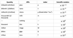
*Note that these engineering units should generally be used only with SI units (meters, seconds).
Good units: megameters, picoamps, terahertz, milliliters
Bad units: kilofeet, gigabarrels
Most units have a one or two letter contraction that can be interchanged with the whole unit and which should be used whenever possible (for example feet → ft and meter → m). A table of SI units can be accessed at Detailed list of metric system units and symbols – US Metric Association (usma.org). Some non-SI units are discussed at UnitConversion.pdf (psu.edu).
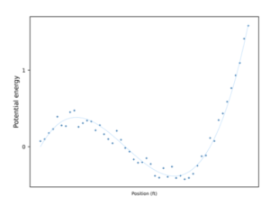
Consider Accessibility
Figures can be made more accessible by ensuring each piece of data on a plot has a unique line and marker style. In the example figure below, each of three conditions is given a unique line style and color.
Image 1: Sample Figure (Source)
Finally, here is an explicit comparison between a good and bad figure from synthetic data. Try to identify what makes each figure good or bad!
 |
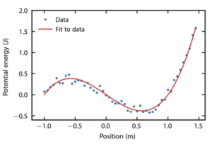 |
What’s wrong with left figure
|
What’s correct with the right figure
|